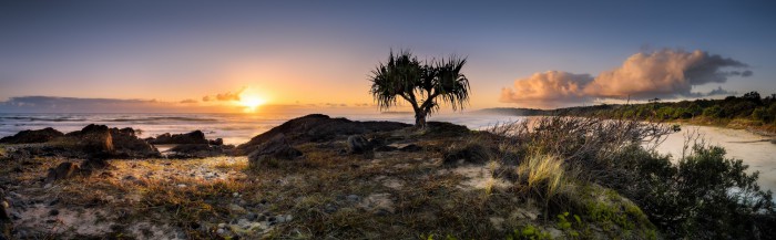
Some images just fall out the computer, others need some real help, this is one such shot, well series of shots, its a 5 shot panorama with each frame bracketed to increase the dynamic range. Just about everything I did to it left it looking washer out, unnatural and generally just looking crap, thus I cut my losses and ended up with this version, not one I am still entirely happy with, however at least something to show for all the darn effort 🙂
I keen for your thoughts? bin it ? too warm, too cool ?
+Gerard Blacklock What don't you like about it Gerard?
Wonderful!!!
Ok, you asked 😀,
For me, it's the composition as well as the colouring. I can see what your doing here and admire your work.
It does have a foreground , the grasses Rhys area, but to my eye it's a little cluttered or undefined.
Then there appears to be two mid grounds. The rocks and palmy trees, and another seperate foreground, the beach to the right. But that is partly obscured by the grass un the foreground. As a result, my eye is a little confuse as to where to look.
The lighting, hence colour may well have been as is shown, but the middle foreground of palm type trees are neither a silloute nor brightly lit.
It also seems implausible that the grassy foreground was lit so brightly, behind the shadow of the mid ground. Again, that may well have been the case, but it looks out of sorts.
Now that I've trampled all over your image 🙂 , I do hope you don't take offence and view my waffling as just subjective constructive criticism.
Or we could simply declare war? Regards, Richard.
Firstly dont bin it ! Panos like these need to be printed large to really get a handle on the overall composition and tones. Its got beautiful detail, composition that lends itself to the format, it deserves to be viewed as big as you can afford to print it. Then mount it on gator board and hang it. After a while .. possibly a long whiles, you will know 🙂 All that effort deserves a trip to the print shop for this one by my reckoning ! Cheers
Nice! I'd be happy with it. 🙂
Wow! If this image doesn't do justice to the scene you witnessed it must have been positively mind blowing!
+Chris Sutton 1) It does not convey the same natural warm tone/feeling I had on the morning. 2) the composition feels disjointed, i would have rather had the sun further around to the left. 3) I think I missed the magic moment for this, i should have captured it just before the sun peaked over the cloud, thus making it a scene with less dynamic range and typically much easier to process.
Thanks +Erika Vees
+Richard Hallford 🙂 well I am gonna ask for more critique in the future 🙂 thanks for taking the time to look and respond, very helpful and I reckon you have nailed it pretty nicely. BTW i will never take offence to anyone providing critique on any of my images. In light of your comments I think a option with a more silhouetted scene coupled with a crop may work alot better, i do have sentimental attachment to the view since i really wanted that wide panoramic view hence my judgement is somewhat clouded 🙂
Thanks again mate, much appreciated.
+Graeme Andrew Thanks Andrew, you are right, these do need to be appreciated large and quite often the thumbnail and smaller sizes do not do the scenes justice, sadly like the majority of my images I won't print them out, its very costly and I have no room to hang them 🙂 just about all the ones I print I give away 🙂
+Lisa Co Thanks Lisa
+Carolyn Fahm hahah , too kind 🙂
+Gerard Blacklock It's never easy to critique photos, because you never know precisely what the photographer was aiming for. Composition "rules" are only a guide, it's the emotion or story that's important in my view. After your reply though, I took another look and produced a "crop" version by altering the image size on my screen. By cropping out the sun with the left side of the image set to top of the small rock outcrop to the left of the tree, I found suddenly the eye was drawn along the beach and the warmth of the light both in the clouds and the bush behind the beach produced a beautiful effect.
Don't bin it!! Many photographers make these image too warm especially around the sun and I hate those too yellow suns while I feel it's warm and not too warm image. Brightness control of bright part and shadow part is spot-on. That is to say, I loooove it!! I feel it's heart-lifting lovely image and superb work, Gerard.
(^ v ^) It well reminds me of happy feeling when I see the first light of the sun even my view is not so wonderful like this…
+Chris Sutton spot on mate, as a photographer I never assume people know what I am aiming for, actually it does not matter to me in most cases, I would rather hear what they see 🙂 I love the way everyoine sees things differently 🙂
The crop you suggested is not something I considered at all.. but now that you planted the idea I am liking it 🙂 m
Thanks +mari m , yeah those warm colours and also reds are hard to control and also portray, it's a delicate balance between over saturated or over warm and over cooked 🙂
Thankyou and have a great week.
Perfect Gerard
+Gerard Blacklock I'd be keen to see the result if you do do a cropped version Gerard.
+Chris Sutton thanks for the reminder 🙂
https://plus.google.com/photos/…
and the other side (I like your option better Chris)
https://plus.google.com/photos/…
+Gerard Blacklock Yep, agree Gerard, the eye travels more comfortably through the first crop version.
Wonderful—